Harmonious interfaces, martial arts and flow states

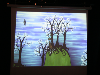
Screenshot of the game flOw

There’s been a few posts from the UX community in the recent past on flow states (most notably at 37signals’s Signal vs. Noise). This got me thinking about my own experiences of flow and what this tells me about how flow states could be induced with interfaces.

A common example of flow states is when playing a game (the player forgets she is pushing buttons on a game pad and is only mindful of the action at hand). I’ve experienced flow while painting but also when doing work on a PC (even when creating wireframes in Visio!) However, the most interesting flow experiences were while practising martial arts.

The interesting bit is that the flow happens when performing techniques in partner exercises or even fighting matches. These are all situations where the ‘system’ consists of two people, not one person and a medium mediated by an interface (if you’re willing to call a paint brush an interface that is).

To reach a state of flow in martial arts you need to stop thinking about performing the technique while performing it, but in stead be mindful of the effect on your partner and try to visualize your own movements accordingly. When flow happens, I’m actually able to ‘see’ a technique as one single image before starting it and while performing it I’m only aware of the whole system, not just myself.

Now here’s the beef. When you try to translate this to interface design, it’s clear that there’s no easy way to induce flow. The obvious approach, to create a ‘disappearing’ interface that is unobtrusive, minimal, etc. is not enough (it could even be harmful). In stead I’d like to suggest you need to make your game, software or site behave more like a martial arts fighter. It needs to push or give way according to the actions of it’s partner. You really need to approach the whole thing as an interconnected system where forces flow back and forth. Flow will happen in the user when he or she can work in a harmonious way. Usually this requires a huge amount of mental model adaptation on the user’s part… When will we create appliances that can infer the intentions of the user and change their stance accordingly? I’m not talking about AI here, but what I would like to see is stuff more along the lines of flOw.

Spatial metaphors in IA and game design

Looking at dominant metaphors in different design disciplines I’m in some way involved in, it’s obvious to me that most are spatial (no surprises there). Here’s some thoughts on how I think this is (or should be) changing. Information architecture tends to approach sites as information spaces (although the web 2.0 hype has brought us a few ‘new’ ones, on which more later.) I do a lot of IA work. I have done quite a bit of game design (and am re-entering that field as a teacher now.) Some of the designers in that field I admire the most (such as Molyneux and Wright) approach games from a more or less spatial standpoint too (and not a narrative perspective, like the vast majority do). I think it was Molyneux who said games are a series of interesting choices. Wright tends to call games ‘possibility spaces’, where a player can explore a number of different solutions to a problem, more than one of which can be viable.

I don’t think I’m going anywhere in particular here, but when looking at IA again, as I just said, the field is currently coming to terms with new ways of looking at the web and web sites; the web as a network, web as platform, the web of data, and so on. Some of these might benefit from a more procedural, i.e. game design-like, stance. I seem to remember Jesse James Garrett giving quite some attention to what he calls ‘algorithmic architecture’ (using Amazon as an example) where the IA is actually creating something akin to a possibility space for the user to explore.

Perhaps when we see more cross-pollination between game design and information architecture and interaction design for the web, we’ll end up with more and more sites that are not only more like desktop applications (the promise of RIA’s) but also more like games. Wouldn’t that be fun and interesting?

Leapfroglog slightly screwed

Due to a screwed up WordPress upgrade from 2.1 to 2.1.1 this blog is now slightly borked. Most notably, the custom theme I so painstakingly created is lost, as well as all the images in the posts that were not included via Flickr. I’ll see if I can rescue some stuff from old backups. Until then, you’ll have to do with the default theme (most of you won’t notice considering that you’re reading the blog in your feed reader anyway).

That’ll teach me to do an upgrade while ill…

Update: I’ve managed to restore most of what I lost during the upgrade. If you come across anything funny, please let me know. Regular blogging will continue from this point on.

Super short Nozbe review

Nozbe is a web app that allows you to organise your to-do’s Getting Things Done style. This morning I spent a little while giving it a spin. I decided to sit down and enter a bunch of actions I have in my Hipster PDA (a Moleskine Memo Pockets and a bunch of blanc index cards) into Nozbe. First impressions:

  1. Nozbe is a cool concept. I have really been waiting for a multidimensional productivity web app. They got this part right! (Projects and contexts are included.)
  2. I like the book excerpts that explain the different GTD concepts such as projects, contexts and actions.
  3. I’d really only consider using Nozbe if it’d include a mobile variant (otherwise my actions are only accessible when I’m online behind a computer).
  4. Nozbe forces you to enter each action in a project up front. This is, I think, a misreading of Allen’s ‘gospel’ and increases the cognitive load when quickly entering an action. I’d have actions be forcibly linked to a context but give the user the option to add it to a project. (I worked around this by creating a ‘No Project’ project and adding actions to it before reorganising.
  5. Contexts are fixed, which is a shame. Please, please, please let me create my own contexts, tagging-style. So I can have actions linked to multiple contexts (which again reduces cognitive load).
  6. Don’t show the duration menu by default when entering an action, keep it clean. I’ll add durations when I want to, but don’t force me to.

Productivity apps are hard to get right because everyone has such a personal workflow. A good app takes that into account and offers many ways to do the same things. So again, Nozbe guys: the app is a good start, congratulations on the good effort! However it could benefit from some more user-centred thinking and design. Try to get a feel for the context of your users and tweak the interface accordingly!

Update: For those who hadn’t noticed, I found this tool via the excellent Lifehacker blog. Nozbe have their own spartan blog too.

Another update: The excellent GTD blog Black Belt Productivity does an in depth review and comes up with some of the same points as I did plus a whole bunch more.

Let’s see if we can post from IMified

So I’m giving IMified (www.imified.com) a spin and have just added the WordPress service to see if it works. For those that haven’t heard about IMified yet; it allows you to do a number of things through instant messaging (MSN, Google Talk, whatever). For instance add stuff to your Backpack account, or like I’m doing now, write a blog post. Let’s publish this to see what happens, hitting ‘return’…

Update: Looks like it’s working! I had to manually insert the link to the website and also go into WordPress to add some categories, so it’s only really useful when you want to fire off a quick note. As a bonus, here’s the Adium window with a transcript of the IMified session.

Leapfroglog now with MonsterID

MonsterID for Kars Alfrink

Just a quick note to let my readers know the comments are now adorned with cute little MonsterIDs. I used this cool plug-in to generate unique monster pictures based on the email address a commenter leaves behind. Curious what yours looks like? Leave a comment and see. The image shown here is my monster (based on kars at leapfrog dot nl).

I used to have gravatars, but they didn’t work as well because hardly any commenters actually have a gravatar registered. These MonsterIDs do the hard work for the user. I like having images in the comments to be able to quickly see who commented and which comments are from the same user. It also helps tell apart people that leave behind the same name.

And, of course, these monsters look great!

Gift outcompetes exchange in design too

I just finished Eric Steven Raymond’s Homesteading the Noosphere. It’s a terrific read for anyone looking for a thorough look at the inner workings of the open source software development community. Like others, whenever reading this kind of stuff sooner or later apophenia hits and I try to tie bits to my own discipline, which isn’t programming but design.

In one of the last chapters of the essay (titled Gift Outcompetes Exchange). Raymond offers some tantalising insights into the relationships between doing complex creative work, motivation, and reward. While reading it I recognised a lot of ideas that I’ve long felt are important but could never really articulate. Now I finally have some great quotes, and (over 10 year old) research to back it up!

Psychologist Theresa Amabile of Brandeis University, cautiously summarizing the results of a 1984 study of motivation and reward, observed “It may be that commissioned work will, in general, be less creative than work that is done out of pure interest.”. Amabile goes on to observe that “The more complex the activity, the more it’s hurt by extrinsic reward.” Interestingly, the studies suggest that flat salaries don’t demotivate, but piecework rates and bonuses do.

Thus, it may be economically smart to give performance bonuses to people who flip burgers or dug ditches, but it’s probably smarter to decouple salary from performance in a programming shop and let people choose their own projects (both trends that the open-source world takes to their logical conclusions). Indeed, these results suggest that the only time it is a good idea to reward performance in programming is when the programmer is so motivated that he or she would have worked without the reward!

Other researchers in the field are willing to point a finger straight at the issues of autonomy and creative control that so preoccupy hackers. “To the extent one’s experience of being self-determined is limited,” said Richard Ryan, associate psychology professor at the University of Rochester, “one’s creativity will be reduced as well.”

So a team of designers working in the mode Raymond describes would choose their own projects and not be rewarded for their performance on projects (which is usually measured in efficiency and client satisfaction). In stead, to really keep them motivated, they’d be given a large amount of autonomy (and wouldn’t be instructed on which problems to solve and how to go about it). Of course, this only works with skilled workers, but I don’t think that’s the reason these philosophies haven’t been applied to design work on the scale they have been in programming. I think a lot of resistance for actually allowing designers work like this in a commercial setting are related to a fear of giving up control. Later on Raymond finishes the chapter with:

Indeed, it seems the prescription for highest software productivity is almost a Zen paradox; if you want the most efficient production, you must give up trying to make programmers produce. Handle their subsistence, give them their heads, and forget about deadlines. To a conventional manager this sounds crazily indulgent and doomed—but it is exactly the recipe with which the open-source culture is now clobbering its competition.

When will the first examples appear of design done in this way? When will the first projects pop up that outcompete the cathedral style designs process (or are they already among us)? Are there any designers out there actually working in this way? I’d love to hear from you.

Update: I changed the link to Flickr into one pointing to a post by Tom Coates on how Flickr was built.

Using concept models to design for the web of data

Flickr concept model by mApplogic

I’m lucky enough to be doing some concepting and interaction design work for a social web site. This presented me with the opportunity to integrate some stuff I found while reading on social software, and the web as platform/network. Here’s how I’ve been integrating some of it.

I was inspired by the concept model of the Flickr ecosystem I saw in Luke Wroblewski’s presentation on social interaction design (which was done by Bryce Glass) to try and create one myself. Coincidentally there’s a whole chapter in Dan Brown’s book (which Peter was smart enough to purchase and was lying around the office) on creating concept models.

One of the things I wanted to do is make the site play nice with the web of data. To that end, I decided to apply Tom Coates’ 3 basic page types to the design of the site. So what I did was first create a concept model (of course following some research of the site’s business and user goals) and then look at the nouns and verbs in the model. For each noun I created a single object view page and a list view page. For each verb I created a manipulation interface page. Of course, all list type pages would get RSS feeds in the eventual site.

For instance if you have a model that states ‘Reviewer rates Book’ then you’d end up with a page for each reviewer and book, a page to list reviewers, a page to list books and a manipulation interface for rating a book.

Doing this resulted in a nice list of pages that I could then analyse for completeness and/or redundancy. Of course this only works if your concept model accurately reflects what the site should achieve. If your model sucks, your list of pages will too.

Another caveat lies in the fact that a concept model tends to be very effective for mapping the functional aspects of a site, but not very suitable for creating an overview of its content (which is often more push oriented). If the kind of site you’re creating involves more information architecture than interaction design you might want to do some additional content inventory work and fold that into the page list.

One last challenge would be organizing these pages in a coherent whole (beyond coupling lists to single items to interfaces). I can imagine I’d attempt some card sorting to achieve that.

Finally, for creating the concept model I used the specialized (and free) tool CmapTools which is pretty nice in that it goes beyond visually modelling the concepts but actually tracking the statements you implicitly make when linking concepts to each other.

Anyone else have experience with trying to integrate some of the stuff Coates was talking about in their design of a site?

Three cool projects out of the Art, Media and Technology faculty

So a week ago I visited a project market at the Art, Media and Technology faculty in Hilversum which is part of the Utrecht School of Arts and offers BA and MA courses in Interaction Design, Game Design & Development and many others.

The range of projects on show was broad and wonderfully presented. It proves the school is still able to integrate arts and crafts with commercial and societal relevant thinking. All projects (over 40 in total) were by master of arts students and commissioned by real world clients. I’d like to point out three projects I particularly enjoyed:

Koe

A tangible interface that models a cow’s insides and allows veterinary students to train at much earlier stage than they do now. The cow model has realistic organs made of silicon (echoes of Realdoll here) and is hooked up to a large display showing a 3D visualization of the student’s actions inside the cow. Crazy, slightly gross but very well done.

Haas

A narrative, literary game called ‘Haas’ (Dutch for hare) that allows the player to intuitively draw the level around the main character. The game’s engine reminded me a bit of Chris Crawford‘s work in that it tracks all kinds of dramatic possibilities in the game and evaluates which is the most appropriate at any time based on available characters, props, etc. Cute and pretty.

Entertaible

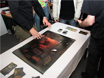
A game developed for Philips’ Entertaible which is a large flat panel multi-touch display that can track game pieces’ location, shape and orientation and has RFID capabilities as well. The game developed has the players explore a haunted mansion (stunningly visualized by the students in a style that is reminiscent of Pixar) and play a number of inventive mini-games. Very professionally done.

For a taste of the project market you can check out this photo album (from which the photos in this post are taken) as well as this video clip by Dutch newspaper AD.

Full disclosure: I currently teach a course in game design for mobile devices and earlier studied interaction and game design between 1998 and 2002 at the same school.

Google Reader improvements

The new Google Reader trends page

I hadn’t touched Google Reader since taking a brief look at its initial launch in October 2005. I’m now using it as my primary reader, having grown tired of Rojo‘s poor performance and frequent interface overhauls. There’s a few things that have really improved since that first release. I’ll sum them up briefly here:

  • Uncluttered, simple interface. They’ve gone back to basics and mimic a plain desktop application UI. Hardly any superfluous web 2.0 features demand your attention.
  • Trends page (I’ve bookmarked a few articles on this); which allows you to look at the feeds you’ve been reading the most but, more importantly, allow you to weed out the ones you never look at or have died. Essential for someone who has over 200 feeds to track.
  • Multi-folder organising, not quite free tagging (which is a shame) but still nice for the folksonomically inclined.
  • When scrolling through a list of expanded new feed items, Reader automatically marks items you’ve scrolled past as read. Which greatly reduces the excise other web-based readers force on their users when wanting to mark a feed as read.
  • Performance is acceptable to good. It’s not as fast as Gmail, but vastly superior to Rojo for instance, despite the considerable use of AJAX.
  • There is an unofficial Mac OS X notifier that uses Growl.

Most of these features are not included in one or both of the previous two web-based readers I used for a length of time (Bloglines and Rojo). Google have really come up with something nice here. I wonder when it’ll move out of the lab.

Why am I not using a desktop based reader? I’d like to (NetNewsWire‘s great for instance), just as I’d love to use a proper desktop email client, but my multi-platform, multi-machine personal and professional use doesn’t allow me too. I work on at least two separate PCs at work (a desktop and a laptop) and have a cute little iBook that I use at home. This all means I am a real web OS user. Firefox as browser (with Google Browser Sync to keep it the same across all installs), Google Reader for RSS, Gmail for email and (until recently) Google Calendar for, well, my calendar. Is it coincidence I seem to prefer Google products for these things? Probably not, Google seems to be doing a very good job at these kind of productivity applications (just as Yahoo! seem to be leading the way in social applications).