Announcing This happened – Utrecht

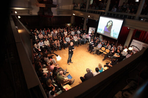
I’m happy to announce This happened – Utrecht; a series of events for interaction designers that I have been working on together with Ianus Keller and Alexander Zeh. On Monday 3 November we’ll have our first edition at Theater Kikker. I’m keeping the line-up to myself for now, but I can assure you it is awesome.

At This happened, you’ll get four to five short lectures by interaction designers about the process behind one of their projects. Each lecture is followed by ample time for discussion. We invite speakers from many different domains, such as products, web, software, games, architecture and art. This way, we hope to show that although the outcomes are different, there is a lot to learn from fellow designers working in areas other than your own.

This happened has been going on in London for some time now, with great success. I can’t remember when exactly I first came across the concept, but I do know that from the start I wanted to introduce it in the Netherlands. Imagine my excitement when I received an enthusiastic response to my proposal from the guys in London.

I believe This happened really adds something to the design event landscape. It isn’t often you get to go somewhere to hear about the hard work that went into finished projects. Usually, you either get a demo of what has been achieved, or you hear someone talk about what it is he would like to work on, not what he’s actually done. Neither is very informative for practising designers. At This happened, the focus is firmly on process, not on outcome, and on making & doing, not (only) on thinking.

Registration is free and will open around two weeks before the event starts. Watch this space, or keep an eye on the official This happened – Utrecht website (in Dutch).

Teaching design for mobile social play

Last week, the group project I am coaching at the Utrecht School of the Arts kicked off. The project is part of the school’s master of arts program. The group consists of ten students with very different backgrounds, ranging from game design & development to audio design, as well as arts management, media studies, and more. Their assignment is to come up with a number of concepts for games that incorporate mobile phones, social interactions, audio and the web. Nokia Research Center has commissioned the project, and Jussi Holopainen, game design researcher and co-author of Patterns in Game Design, is the client. In the project brief there is a strong emphasis on sketching and prototyping, and disciplined documentation of the design process. The students are working full time on the project and it will run for around 4 months.

I am very happy with the opportunity to coach this group. It’s a new challenge for me as a teacher – moving away from teaching theory and into the area of facilitation. I am also looking forward to seeing what the students will come up with, of course, as the domain they are working in overlaps hugely with my interests. So far, working with Jussi has proven to be very inspirational, so I am getting something out of it as a designer too.

Download my travel-time map

I am a bit nervous about doing this, but since several people asked, here goes: You can now download the travel-time map of the Netherlands I made in Processing. I have exported applications for Linux, Mac OS X and Windows. Each download includes the source files, but not the data file. For that, you will need to head to Alper’s site (he’s the guy who pulled the data from 9292 and ANWB). I hope you’ll enjoy playing around with this, or learn something from the way it was put together.

Some notes, in no particular order:

  • Please remember I am not a programmer. The vast majority of this sketch was put together from bits and pieces of code I found in books and online. I have tried to credit all the sources in the code. The full write-up I posted earlier should point you to all the sources too. In short; all the good bits are by other people, the bad code is mine. But who cares, it’s the end-result that counts (at least for me).
  • Related to the previous point is the fact that I cannot figure out under which license (if any) to release this. So the usual CC by-nc-sa license applies, as far as I’m concerned.
  • If this breaks your computer, offends you, makes you cry, or eats your kittens, do not come knocking. This is provided as is, no warranties whatsoever, etc.
  • Why am I nervous? Probably because for me the point of the whole exercise was the process, not the outcome.
  • I can’t think of anything else. Have fun.

Design-related endnotes for MoMo AMS #7

Yesterday I attended my first Mobile Monday in Amsterdam. The theme was “value” and in my mind, I had already equated the term with “user experience”. This was a mistake. Contrary to my expectations, the event was well outside of my comfort zone. Discussions were dominated by business and technology perspectives. I found the experience frustrating at times, but I guess this is good. Frustration often leads to new insights. Therefore, although this may not sound as a recommendation, I would say MoMo is an event worth visiting for any designer interested in mobility. It will remind you that in this industry, many ideas you take for granted are far from accepted.

I thought I’d share some thoughts concerning the salient points of the evening.

Mobile Monday #7

Context

Context was often equated with location. To me, these two are far from the same. Location is, at best, a component of context, which also involves what people are doing, who else is there, what objects are present, etc. But, more importantly: Context arises from interactions, it is relational and therefore cannot be objectified. Coincidentally, Adam Greenfield has posted some valuable insights on this topic.

As an example, consider a person present in the White House, in the possession of a firearm, in clear sight of the president. The meaning of this situation (i.e. the context) depends completely on who this person is and what his motivations are. He might be working (bodyguarding the president), he might be at war (making an attempt at the president’s life) or he might be playing around (the gun isn’t real, he’s the president’s son).

Anyway — I subscribe to the view that we should not attempt to guess context, the above example has hopefully shown that this is an impossible task. (At least, as long as we cannot reliably read the minds of people.) In stead, we should ‘limit’ ourselves to giving places, things, etc. a voice in the conversation (making them self-describing, and accountable) and having context arise those voices, as determined by the people involved.

Open source

Ajit Jaokar posited that open source mobile software (such as Android) will lead to new device manufacturers entering the arena. The analogy was made to the PC industry with the emergence of white-label boxes. I wonder though, for this to truly happen, shouldn’t the hardware be open-sourced too, not (just) the software?

In any case, I think having more handset manufacturers is wonderful. Not in the least for the fact that it will open the door for a more diverse offering, one potentially tailored to regions so far under-served by device manufacturers. Which brings me to my next point.

Local, global, diversity, relevance…

Several speakers alluded to the fact that mobile is a global market, and that businesses shouldn’t be shy about launching world-wide. I see several issues with this. First of all, without wanting to sound too anti-globalistic, do we really want to continue on making stuff that is the same no matter where you go? I find diversity a vital stimulus in my life and would hate to see software experiences become more and more the same the world over.

Let’s in stead consider the following: A service that might make perfect sense in one locale very likely does not offer any distinctive value in another. I think the example of the now defunct Skoeps1, which was discussed at the event, illustrates this perfectly. It did not work in the Dutch market, but offers real value in ‘developing’ countries, where the amount of video crews on the ground is limited and images captured by locals using mobile phones are therefore a welcome addition to the ‘official’ coverage.

Context redux

Which brings me back to the question of context, but in this case, the role it plays not as a component of a service, but in the design and development process itself. I was sad to see the most important point of Rachel Hinman’s video message go unnoticed (at least, judging from the fact that it was not discussed at all). She said that starting point for any new service should be to go out “into the wild” and observe what people are doing, what they want, what they need, what they enjoy and so on.2 From this real and deep understanding of people’s contexts, you can start making meaningful choices that will help you create something that offers true value.

It was this notion of starting from people’s context that I found most lacking at MoMo AMS. Besides Hinman, I was surprised to find only Yme Bosma of Hyves3 alluding to it. Who’d have thought?

  1. Skoeps — pronounced “scoops” — was a social video site focused on citizen journalism. It went out of business because not enough “users” were “generating content”. Ugh. [↩]
  2. Not surprisingly, Hinman works at Adaptive Path. Athough I very much agree with her presentation’s premise, I felt her example was a bit disingenuous. I find it hard to believe Apple designed iTunes to fit the mixtape usage scenario. This, I think, is more of a happy coincidence than anything else. [↩]
  3. Hyves is the biggest social networking site of the Netherlands. [↩]

Playing with emergence is like gardening

It’s been a while since I finished reading Steven Berlin Johnson’s Emergence. I picked up the book because ever since I started thinking about what IxDs can learn from game design, the concept of emergence kept popping up.

Johnson’s book is a pleasant read, an easy-going introduction to the subject. I started and finished it over the course of a weekend. There were a few passages I marked as I went a long, and I’d like to quote them here and comment on them. In order, they are about:

  1. Principles that are required for emergence to happen
  2. How learning can be unconscious
  3. Unique skills of game players
  4. Gardening as a metaphor for using (and making) emergent systems

A cheat sheet

Let’s start with the principles.1

“If you’re building a system designed to learn from the ground level, a system where macrointelligence and adaptability derive from local knowledge, there are five fundamental principles you need to follow.”

These principles together form a useful crib sheet for designers working on social software, MMOGs, etc. I’ll summarise each of Johnson’s principles here.

“More is different.”

You need to have a sizeable amount of low-level elements interacting to get patterns emerging. Also, there is a difference between the behaviour you will observe on the microlevel, and on the macrolevel. You need to be aware of both.

“Ignorance is useful.”

The simple elements don’t have to be aware of the higher-level order. In fact, it’s best if they aren’t. Otherwise nasty feedback-loops might come into being.

“Encourage random encounters.”

You need chance happenings for the system to be able to learn and adapt.2

“Look for patterns in the signs.”

Simply put, the basic elements can have a simple vocabulary, but should be able to recognise patterns. So although you might be working with only one signal, things such as frequency and intensity should be used to make a range of meanings.

“Pay attention to your neighbours.”

There must be as much interaction between the components as possible. They should be made constantly aware of each other.

Now with these principles in mind look at systems that successfully leverage collective intelligence. Look at Flickr for instance. They are all present.

Chicken pox

I liked the following passage because it seems to offer a nice metaphor for what I think is the unique kind of learning that happens while playing. In a way, games and toys are like chicken pox.3

“[…] learning is not always contingent on consciousness. […] Most of us have developed immunity to the varicella-zoster virus—also known as chicken pox—based on our exposure to it early in childhood. The immunity is a learning process: the antibodies of our immune system learn to neutralize the antigens of the virus, and they remember those neutralization strategies for the rest of our lives. […] Those antibodies function as a “recognition system,” in Gerald Edelman’s phrase, successfully attacking the virus and storing the information about it, then recalling that information the next time the virus comes across the radar. […] the recognition unfolds purely on a cellular level: we are not aware of the varicella-zoster virus in any sense of the word, […] The body learns without consciousness, and so do cities, because learning is not just about being aware of information; it’s also about storing information and knowing where to find it. […] It’s about altering a system’s behaviour in response to those patterns in ways that make the system more successful at whatever goal it’s pursuing. The system need not be conscious to be capable of that kind of learning.”

Emphasis on the last sentence mine, by the way.

Patience

Johnson writes about his impression of children playing video games:4

“[…] they are more tolerant of being out of control, more tolerant of that exploratory phase where the rules don’t all make sense, and where few goals have been clearly defined.”

This attitude is very valuable in today’s increasingly complex world. It should be fostered and leveraged in areas besides gaming too, IMHO. This point was at the core of my Playing With Complexity talk.

Gardening

“Interacting with emergent software is already more like growing a garden than driving a car or reading a book.”5

Yet, we still tend to approach the design of systems like this from a tradition of making tools (cars) or media (books). I not only believe that the use of systems like this is like gardening, but also their creation. Perhaps they lie in each other’s extension, are part of one never-ending cycle? In any case, when designing complex systems, you need to work with it “live”. Plant some seeds, observe, prune, weed, plant some more, etc.

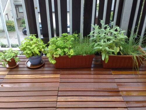
I am going to keep a garden (on my balcony). I’m pretty sure that will teach me more about interaction design than building cars or writing books.

It's a start
  1. The following quotes are taken from pages 77-79. [↩]
  2. This reminds me of Nassim Nicholas Taleb’s The Black Swan, wherein he writes about maximising your chance of having serendipitous encounters. [↩]
  3. Taken from pages 103-104. [↩]
  4. Page 177. [↩]
  5. Page 207. [↩]

The making of a travel-time map of the Netherlands

Subscribers to my Flickr stream have probably noticed a number of images of some kind of map flowing past lately. They were the result of me tracking my progress on a pet project. I have more or less finished work on it this week, so I thought I’d detail what I did over here.

Background

Following my Twitter dataviz sketches, I thought I’d take another stab at prototyping with Processing. On the one hand I wanted to increase my familiarity with the environment. On the other, I continued to be fascinated with data-visualization, so I wanted to do another design exercise in this domain. I was particularly interested in creating displays that assist in decision making and present data in a way that allows people to ‘play’ with it — explore it and learn from it.

The seed for this thing was planted when I saw Stamen’s work on the mySociety travel-time maps. I thought the idea of visually overlaying two datasets and allowing the intersection to be manipulated by people was simple but powerful. But, at that time, I saw no way to ‘easily’ try my hand at something similar. I had no ready access to any potentially interesting data, and my scraping skills are limited at best.

Luckily, I was not the only one whose curiosity was piqued. After seeing Ben Cerveny demoing the same maps at The Web and Beyond 2008, Alper wondered how hard it would be to create something similar for the Netherlands. He presented a way to do it with freely available tools and data (to an extent) in a workshop at a local unconference.1

I did not attend the event, but after seeing his blog post, I sent him an email and asked if he was willing to part with the data he had collected from the Dutch public transport travel planning site 9292. Alper being the nice guy he is, he soon emailed me a JSON containing of the data.

So that’s the background. I had an example, I had some data, and I had a little experience with making things in Processing.

JSON

The first step was to read the data in the JSON file from Processing. I followed the instructions on how to get the JSON library into Processing from Ben Fry’s book (pages 315-316). On the Processing boards, a cursory search unearthed some code examples. After a little fiddling, I got it to work and could print the data to Processing’s console.

Plotting

Next up was to start visualizing it. I used the examples of scatterplot maps in Visualizing Data as a starting point, and plugged in the JSON data. Pretty soon, I had a nice plot of the postal codes that actually resembled the Netherlands.
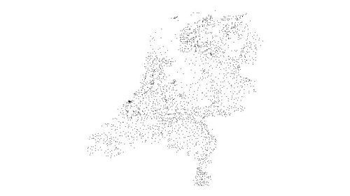
Playing with some data Alper gave me

Coloring

From there, it was rather easy to show each postal code’s travel time.2 I simply mapped travel times to a hue in the HSB spectrum. The result nicely shows colored bands of travel-time regions and also allows you to pick out some interesting outliers (such as Groningen in the north).
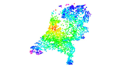
Second pass

Selecting

At this point, I wanted to be able to select travel-time ranges and hide postal codes outside of that range. Initially, I used the keyboard for input. This was OK for this stage of the project, but of course it would need to be replaced with something more intuitive later on. In any case, I could highlight selected points and dim others, which increased the display’s explorability considerably.
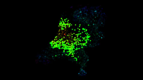
Pass 3

Coloring, again

The HSB spectrum is quick and easy way of getting access to a full a range of colors. It served me well in my Twitter visualizations. However in this case it left something to be desired, aesthetically speaking. Via Tom Carden I found the wonderful cpt-city, which catalogues gradients for cartography and the like. Initially I struggled with ways to get these colors into Processing, but then it turned out you could easily read out the colors of pixels from images. This allowed me to cycle through many palettes just by adding the files to my Processing sketch. I discovered that a palette with a clear division in the middle was best, because that provides you with an extra reference point besides the beginning and end.
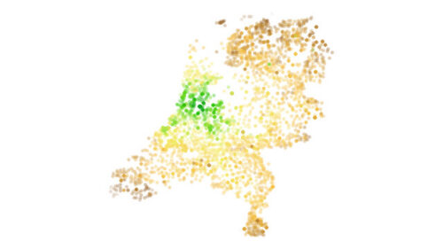
Playing with palettes (pass 4)

Selecting, again

I next turned to the interaction bits. I knew I wanted a so-called dual slider that would allow people to select the upper and lower limit of travel time. In the Processing book, there is code for plenty of interface widgets, but sadly no dual slider. I looked around on the Processing board and could find none either, to my surprise. Even in the UI libraries (such as controlP5 and Interfascia) I could not locate one.

So I decided to lower the bar and first include two horizontal sliders, one for the upper and one for the lower limit. These I made using the code on pages 448-452 of the Processing book. Not perfect, but an improvement over the keyboard controls.
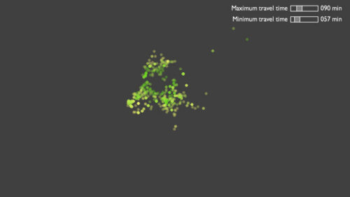
Pass 5 – some basic interactivity

Selecting, yet again

Next, I decided I’d see if I could modify the code of the horizontal scrollbar so that I would end up with a dual slider. After some messing about (which did increase my understanding of the original code considerably) I managed to get it to work. This was an unexpected success. I now had a decent dual slider.
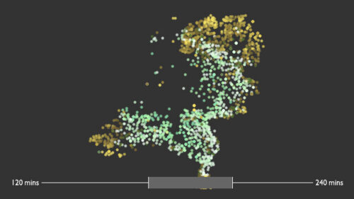
A proper dual slider

Exploring

So far there was no way of telling which point corresponded to which postal code. So, I added a rollover that displayed the postal code’s name and travel time. At this point it became clear the data wasn’t perfect — some postal codes were erroneously geocoded by GeoNames. For instance, code 9843 (which is Grijpskerk, 199 minutes to the Dam) was placed on the map as Amsterdam Noord-Oost!
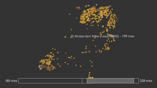
Rollovers

Adding more data

Around this point I visited Alper in Delft and we discussed adding a second dataset. Although housing prices à la mySociety would have been interesting, we decided to take a different route and add a second travel-time set for cars.3 My first step in integrating this was to simply generate a map each for the public transport and car travel data and manually juxtapose them. What I liked about this was that even though you know intuitively that traveling by car is faster, the two maps next to each other provide a dramatic visual confirmation of this piece of knowledge.
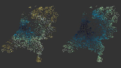
Compare: travel by public transport or car

Representing

Moving ahead with the extra data, I started to struggle with how to represent both travel times. My first effort was to draw two sets of dots on top of each other (one for car travel times and one for public transport) and color each accordingly. For each set I introduced a separate slider. I wasn’t very satisfied with the result of this. It did not help in understanding what was going on that much.
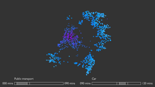
The gap

Showing differences

After discussions with Alper and several other people, I decided it would make more sense to show the difference between travel times. So I calculated the percentage difference between public transport and car travel time for each postal code. This value I mapped to a color. Here, a simple gradient worked better than the palettes used earlier for travel times.

I also discarded the idea of having two dual sliders and simply went with one travel time selector. Although more user-friendly, it created a new problem: for some points both travel times would fall within the selected range, and for others one or the other. So I needed an extra visual dimension to show this. This turned out to be the greatest challenge.

After trying many approaches, I eventually settled on using the shape of the point to show which travel times fell within the range. A small dot meant that only the public transport travel time is within the range, a donut means only the car travel time is selected, and a big dot represents selection of both times.
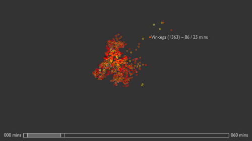
Return of the map

Final tweaks

Around this point I felt that it was time to wrap up. I had learnt about all I could from the exercise and any extra time spent on the project would result in marginal improvements at best. I added a legend for both the shapes and color, improved the legibility of the rollover and increased the visual affordance of the slider, and that was it.
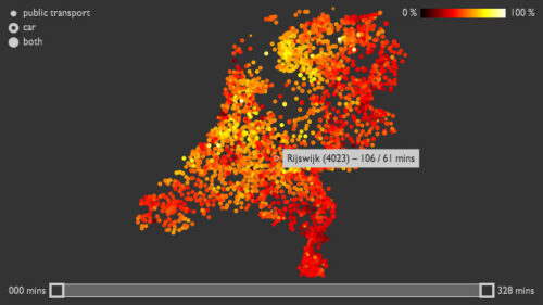
It's hard to stop tweaking

Thoughts

It is becoming apparent to me that the act of building displays like this is playful in its own way. Through sketching in code, you can have something like a conversation with the data and get a sense of what’s there. Perhaps the end result is merely a byproduct of this process?

I’m amazed at how far a novice programmer like myself, with a dramatic lack of affinity for anything related to mathematics or physics, can get by simply modifying, augmenting and combining code that is already out there. I have no ambition whatsoever of becoming a professional developer of production-quality code. But building a collection bits and pieces of code that can do useful and interesting things seems like a good strategy for any designer. I am learning to trust my innate reluctance to code stuff from scratch.

Also, isn’t it cool that it is becoming increasingly feasible for regular citizens to start analyzing data that is — or at least should be — publicly available? Government still has a long way to go. Why do we need to go through the painstaking process of scraping this data from sources such as 9292 which for all intents and purposes is a public service?4

I will probably make the final prototype available online at some point in the future. For now, if you have any questions or comments I would love to hear them here, or via email.

Update: Alper has released a JSON file containing all the data I used to make this. Go on and grab it, and make some displays of your own!

And another update: I’ve decided to make this application available for download, including source files.

  1. Those of you who understand Dutch might enjoy his walkthrough on Vimeo. [↩]
  2. Incidentally, all travel times in this project were from the Dam in Amsterdam to all the postal codes in NL. [↩]
  3. This we retrieved from the ANWB site. The time of day was set to 12:00 noon. [↩]
  4. Tools like Mechanize make this easier, but still. [↩]

A day of playing around with multi-touch and RoomWare

Last Saturday I attended a RoomWare workshop. The people of CanTouch were there too, and brought one of their prototype multi-touch tables. The aim for the day was to come up with applications of RoomWare (open source software that can sense presence of people in spaces) and multi-touch. I attended primarily because it was a good opportunity to spend a day messing around with a table.

Attendance was multifaceted, so while programmers were putting together a proof-of-concept, designers (such as Alexander Zeh, James Burke and I) came up with concepts for new interactions. The proof-of-concept was up and running at the end of then day: The table could sense who was in the room and display his or her Flickr photos, which you could then move around, scale, rotate, etc. in the typical multi-touch fashion.

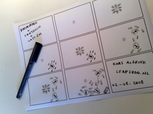
The concepts designers came up with mainly focused on pulling in Last.fm data (again using RoomWare’s sensing capabilities) and displaying it for group-based exploration. Here’s a storyboard I quickly whipped up of one such application:

RoomWare + CanTouch + Last.fm

The storyboard shows how you can add yourself from a list of people present in the room. Your top artists flock around you. When more people are added, lines are drawn between you. The thickness of the line represents how similar your tastes are, according to Last.fm’s taste-o-meter. Also, shared top artists flock in such a way as to be closest to all related people. Finally, artists can be acted on to listen to music.

When I was sketching this, it became apparent that orientation of elements should follow very different rules from regular screens. I chose to sketch things so that they all point outwards, with the middle of the table as the orientation point.

By spending a day immersed in multi-touch stuff, some interesting design challenges became apparent:

  • With tabletop surfaces, stuff is closer or further away physically. Proximity of elements can be unintentionally interpreted as saying something about aspects such as importance, relevance, etc. Designers need to be even more aware of placement than before, plus conventions from vertically oriented screens no longer apply. Top-of-screen becomes furthest away and therefore least prominent in stead of most important.
  • With group-based interactions, it becomes tricky to determine who to address and where to address him or her. Sometimes the system should address the group as a whole. When 5 people are standing around a table, text-based interfaces become problematic since what is legible from one end of the table is unintelligible from the other. New conventions need to be developed for this as well. Alexander and I philosophized about placing text along circles and animating them so that they circulate around the table, for instance.
  • Besides these, many other interface challenges present themselves. One crucial piece of information for solving many of these is knowing where people are located around the table. This issue can be approached from different angles. By incorporating sensors in the table, detection may be automated and interfaces could me made to adapt automatically. This is the techno-centric angle. I am not convinced this is the way to go, because it diminishes people’s control over the experience. I would prefer to make the interface itself adjustable in natural ways, so that people can mold the representation to suit their context. With situated technologies like this, auto-magical adaptation is an “AI-hard” problem, and the price of failure is a severely degraded user experience from which people cannot recover because the system won’t let them.

All in all the workshop was a wonderful day of tinkering with like-minded individuals from radically different backgrounds. As a designer, I think this is one of the best way be involved with open source projects. On a day like this, technologists can be exposed to new interaction concepts while they are hacking away. At the same time designers get that rare opportunity to play around with technology as it is shaped. Quick-and-dirty sketches like the ones Alexander and I came up with are definitely the way to communicate ideas. The goal is to suggest, not to describe, after all. Technologists should feel free to elaborate and build on what designers come up with and vice-versa. I am curious to see which parts of what we came up with will find their way into future RoomWare projects.

Embodied interaction and improvised information displays

Recently a good friend of mine became a dad. It made me feel really old, but it also lead to an encounter with an improvised information display, which I’d like to tell you about, because it illustrates some of the things I have learnt from reading Paul Dourish’s Where the Action Is.

My friend’s son was born a bit too early, so we went to see him (the son) at the neonatology ward of the local hospital. It was there that I saw this whiteboard with stickers, writing and the familiar magnets on it:

Tracing of a photo of an improvised information display in a hospital neonatology ward consisting of a whiteboard, magnets, stickers and writing

(I decided to trace the photo I took of it and replace the names with fictional ones.)

Now, at first I only noticed parts of what was there. I saw the patient names on the left-hand side, and recognised the name of my friend’s son. I also noticed that on the right-hand side, the names of all the nurses on duty were there. I did not think much more of it.

Before leaving, my friend walked up to the whiteboard and said something along the lines of “yes, this is correct,” and touched one of the green magnets that was in the middle of the board as if to confirm this. It was then that my curiosity was piqued, and I asked my friend to explain what the board meant.

It turns out it was a wonderful thing, something I’ll call an improvised information display, for lack of a better word. What I had not seen the first time around, but were pointed out by my friend:

  1. There is a time axis along the top of the board. By placing a green magnet at the height of a child’s name somewhere along this axis, parents can let the staff know when they intend to visit. This is important for many reasons. One being that it helps the nurses time the moment a child will be fed so that the parents can be present. So in the example, the parents of ‘Faramond’ will be visiting around 21:00 hours.
  2. There are different colour magnets behind the children’s names, and behind the nurses’ names. This shows which nurse is responsible for which child. For instance, ‘Charlotte’ is in charge of ‘Once’s’ care.

Dourish’s book has influenced the way I look at things like this. It has made me more aware of their unique value. Whereas before I would think that something like this could be done better by a proper designer, with digital means, I now think the grasp-able aspect of such a display is vital. I also now believe that the prominent role of users in shaping the display is vital. Dourish writes:1

“What embodied interaction adds to existing representational practice is the understanding that representations are also themselves artefacts. Not only do they allow users to “reach through” and act upon the entity being represented, but they can also themselves be acted upon—picked up, examined, manipulated and rearranged.”

Parents and nurses reach through the display I saw in the neonatology ward to act upon the information about visiting times and responsibility of care. But they also act on the components of the display itself to manipulate the meaning they have.

In fact, this is how the display was constructed in the first place! The role of the designer in this display was limited to the components themselves. Designers were responsible for the affordances of the whiteboard, the magnets, the erasable markers and stickers, which enabled users to produce the information display they needed. In the words of Dourish:2

“Principle: Users, not designers, create and communicate meaning.”

“Principle: Users, not designers, manage coupling.”

It is the nurses and the parents and the social practice they together constitute that gives rise to the meaning of the display. What the board means is obvious to them, because they have ‘work’ that needs to be done together. It was not obvious to me, because I am not part of that group. It was not a designer that decided what the meaning of the different colours of the magnets were. It was a group of users who coupled meaning to the components they had available to them.

It might be a radical example, but I think this does demonstrate what people can do if the right components are made available to them, and they are allowed to make their own meaning with them. I think it is important for designers to realise this, and allow for this kind of manipulation of the products and services they shape. Clearly, Dourish’s notion of embodied interaction is a key to designing for adaptation and hacking. When it comes to this, today’s whiteboards, magnets and markers seem to do a better job than many of our current digital technologies.

  1. Page 169 [↩]
  2. Page 170 [↩]

Chris Crawford on design suggestions

I have a considerable amount of books with dog-eared pages lying around the office. One such book is The Game Design Reader, which contains a large and varied collection of essays on (yes) game design. This book probably has the largest number of dog-ears. Partly because it is quite thick, but also because it is filled to the brim with good stuff.

One essay is written by Chris Crawford. He is without a doubt one of the best known game designers out there, a real veteran of the industry. He is also a controversial character, often voicing unpopular opinions. I guess you could call him an iconoclast.

This iconoclasm shines through in his essay for TGDR. Crawford shares the story behind the design of Eastern Front (1941) his “first big hit”. Towards the end, he devotes some attention to game tuning, and has this to say about how you as a designer should approach suggestions from others:1

“Your job is to build a great design, not gratify your co-workers.”

According to him, a good designer has thought the system through so thoroughly, that the vast majority of suggestions have already passed through his mind. Therefore, these can all be rejected without much thought. If you are swamped with suggestions you have not thought of before, this is an indication you have not properly done your job.

I can only agree, but I think the real challenge is in rejecting these ideas in a persuasive manner. It is hard to make apparent the fact that you have thought all these things through.

One strategy I am pursuing is to be radically transparent in my process. I try to document every single consideration using quick and dirty sketches, and share all of these. This way, I hope to make apparent the thinking that has gone into the design.

What Chris Crawford makes clear is that design isn’t a popularity contest:2

“This isn’t noble; it’s stupid. Seriously considering every idea that drifts by isn’t a sign of open mindedness; it’s an indicator of indecisiveness. […] Be courteous, but concentrate on doing your job.”

Some time ago, Crawford more or less turned his back on the games industry and focussed his attention on the thorny problem of interactive storytelling. The outcomes of this are finally seeing the light of day in the shape of Storytron; a company that offers a free authoring tool as well as ready-to-play ‘storyworlds’.

I wasn’t too impressed with the interaction design of the authoring tool, but the concept remains intriguing. We’ll see where it goes.

If this has piqued your curiosity; Chris Crawford will be speaking at IDEA 2008 in Chicago, 7–8 October. Reason enough to attend, in my humble opinion.

  1. Page 723 [↩]
  2. Ibid. [↩]

Goodbye DK, Hello NL

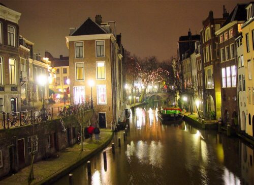
A photo of the Oude Gracht in Utrecht, the Netherlands taken by Josef F. Stuefer

And that was it. After exactly one year in Copenhagen I am back in Utrecht. I enjoyed my time in Denmark tremendously, it has proven to be a great place to start my new life as a freelance designer. Now I will continue my practice over here. Different city, same international outlook.

The final period in Copenhagen consisted mainly of me speaking at a lot of conferences. First there was The Web and Beyond, then came From Business to Buttons, NLGD Festival of Games and finally Reboot — I could not have wished for a better going-away party.

There is not much time to catch my breath, however. I have client projects happening throughout July and of course there is also plenty of unpacking and merging of the old and new life to be done. I hope to publish the NLGD and Reboot stuff shortly, but it might take me a while.

Now that I am back in the Netherlands, I can also move forward with some small plans I’ve had for some time: one being a local design event and the other a ‘different’ kind of office space. I am also still looking for a creative technologist to partner up with on potential future projects. If any of this piques your interest, do drop me a line.

Photo credits: Josef F. Stuefer.