Play in social and tangible interactions

Now that the IxDA has post­ed a video of my pre­sen­ta­tion at Inter­ac­tion 09 to Vimeo, I thought it would be a good idea to pro­vide a lit­tle back­ground to the talk. I had already post­ed the slides to SlideShare, so a full write-up doesn’t seem nec­es­sary. To pro­vide a lit­tle con­text though, I will sum­ma­rize the thing.

Sum­ma­ry

The idea of the talk was to look at a few qual­i­ties of embod­ied inter­ac­tion, and relate them to games and play, in the hopes of illu­mi­nat­ing some design oppor­tu­ni­ties. With­out dwelling on what embod­i­ment real­ly means, suf­fice to say that there is a school of thought that states that our think­ing orig­i­nates in our bod­i­ly expe­ri­ence of the world around us, and our rela­tion­ships with the peo­ple in it. I used the exam­ple of an impro­vised infor­ma­tion dis­play I once encoun­tered in the pae­di­atric ward of a local hos­pi­tal to high­light two qual­i­ties of embod­ied inter­ac­tion: (1) mean­ing is social­ly con­struct­ed and (2) cog­ni­tion is facil­i­tat­ed by tan­gi­bil­i­ty.1

ix09-lightning-talk-presented012

With regards to the first aspect — the social con­struc­tion of mean­ing — I find it inter­est­ing that in games, you find a dis­tinc­tion between the offi­cial rules to a game, and the rules that are arrived at through mutu­al con­sent by the play­ers, the lat­ter being how the game is actu­al­ly played. Using the exam­ple of an impro­vised manège in Hab­bo, I point­ed out that under-spec­i­fied design tends to encour­age the emer­gence of such inter­est­ing uses. What it comes down to, as a design­er, is to under­stand that once peo­ple get togeth­er to do stuff, and it involves the thing you’ve designed, they will lay­er new mean­ings on top of what you came up with, which is large­ly out of your control. 

ix09-lightning-talk-presented015

For the sec­ond aspect — cog­ni­tion being facil­i­tat­ed by tan­gi­bil­i­ty — I talked about how peo­ple use the world around them to offload men­tal com­pu­ta­tion. For instance, when peo­ple get bet­ter at play­ing Tetris, they start back­track­ing more than when they just start­ed play­ing. They are essen­tial­ly using the game’s space to think with. As an aside, I point­ed out that in my expe­ri­ence, sketch­ing plays a sim­i­lar role when design­ing. As with the social con­struc­tion of mean­ing, for epis­temic action to be pos­si­ble, the sys­tem in use needs to be adaptable.

ix09-lightning-talk-presented025

To wrap up, I sug­gest­ed that, when it comes to the design of embod­ied inter­ac­tive stuff, we are strug­gling with the same issues as game design­ers. We’re both posi­tion­ing our­selves (in the words of Eric Zim­mer­man) as meta-cre­ators of mean­ing; as design­ers of spaces in which peo­ple dis­cov­er new things about them­selves, the world around them and the peo­ple in it.

Sources

I had sev­er­al peo­ple come up to me after­wards, ask­ing for sources, so I’ll list them here. 

  • the sig­nif­i­cance of the social con­struc­tion of mean­ing for inter­ac­tion design is explained in detail by Paul Dour­ish in his book Where the Action Is
  • the research by Jean Piaget I quot­ed is from his book The Moral Judge­ment of the Child (which I first encoun­tered in Rules of Play, see below)
  • the con­cept of ide­al ver­sus real rules is from the won­der­ful book Rules of Play by Katie Salen and Eric Zim­mer­man (who in turn have tak­en it from Ken­neth Goldstein’s arti­cle Strate­gies in Count­ing Out)
  • for a won­der­ful descrip­tion of how chil­dren social­ly medi­ate the rules to a game, have a look at the arti­cle Beyond the Rules of the Game by Lin­da Hugh­es (col­lect­ed in the Game Design Read­er)
  • the Will Wright quote is from an inter­view in Tra­cy Fullerton’s book Game Design Work­shop, sec­ond edition
  • for a dis­cus­sion of prag­mat­ic ver­sus epis­temic action and how it relates to inter­ac­tion design, refer to the arti­cle How Bod­ies Mat­ter (PDF) by Scott Klem­mer, Björn Hart­mann and Leila Takaya­ma (which is right­ful­ly rec­om­mend­ed by Dan Saf­fer in his book, Design­ing Ges­tur­al Inter­faces)
  • the Tetris research (which I first found in the pre­vi­ous­ly men­tioned arti­cle) is described in Epis­temic Action Increas­es With Skill (PDF), an arti­cle by Paul Maglio and David Kirsh
  • the “play is free move­ment…” quote is from Rules of Play
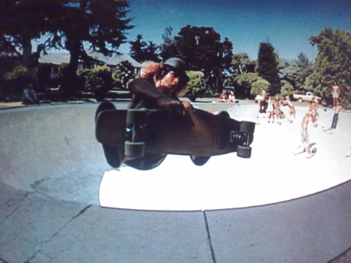
  • the pic­ture of the guy skate­board­ing is a still from the awe­some doc­u­men­tary film Dog­town and Z‑Boys
  • for a lot of great think­ing on “loose fit” design, be sure to check out the book How Build­ings Learn by Stew­art Brand
  • the “meta-cre­ators of mean­ing” quote is from Eric Zimmerman’s fore­word to the afore­men­tioned Game Design Work­shop, 2nd ed.

Thanks

And that’s it. Inter­ac­tion 09 was a great event, I’m hap­py to have been a part of it. Most of the talks seem to be online now. So why not check them out? My favourites by far were John Thackara and Robert Fab­ri­cant. Thanks to the peo­ple of the IxDA for all the effort they put into increas­ing inter­ac­tion design’s vis­i­bil­i­ty to the world.

  1. For a detailed dis­cus­sion of the infor­ma­tion dis­play, have a look at this blog post. []

Reboot 10 slides and video

I am break­ing radio-silence for a bit to let you know the slides and video for my Reboot 10 pre­sen­ta­tion are now avail­able online, in case you’re inter­est­ed. I pre­sent­ed this talk before at The Web and Beyond, but this time I had a lot more time, and I pre­sent­ed in Eng­lish. I there­fore think this might still be of inter­est to some peo­ple.1 As always, I am very inter­est­ed in receiv­ing con­struc­tive crit­i­cism Just drop me a line in the comments.

Update: It occurred to me that it might be a good idea to briefly sum­ma­rize what this is about. This is a pre­sen­ta­tion in two parts. In the first, I the­o­rize about the emer­gence of games that have as their goal the con­vey­ing of an argu­ment. These games would use the real-time city as their plat­form. It is these games that I call urban pro­ce­dur­al rhetorics. In the sec­ond part I give a few exam­ples of what such games might look like, using a series of sketches.

The slides, posted to SlideShare, as usual:

The video, hosted on the Reboot website:

  1. I did post a tran­script in Eng­lish before, in case you pre­fer read­ing to lis­ten­ing. []

A day of playing around with multi-touch and RoomWare

Last Sat­ur­day I attend­ed a RoomWare work­shop. The peo­ple of Can­Touch were there too, and brought one of their pro­to­type mul­ti-touch tables. The aim for the day was to come up with appli­ca­tions of RoomWare (open source soft­ware that can sense pres­ence of peo­ple in spaces) and mul­ti-touch. I attend­ed pri­mar­i­ly because it was a good oppor­tu­ni­ty to spend a day mess­ing around with a table.

Atten­dance was mul­ti­fac­eted, so while pro­gram­mers were putting togeth­er a proof-of-con­cept, design­ers (such as Alexan­der Zeh, James Burke and I) came up with con­cepts for new inter­ac­tions. The proof-of-con­cept was up and run­ning at the end of then day: The table could sense who was in the room and dis­play his or her Flickr pho­tos, which you could then move around, scale, rotate, etc. in the typ­i­cal mul­ti-touch fashion.

The con­cepts design­ers came up with main­ly focused on pulling in Last.fm data (again using RoomWare’s sens­ing capa­bil­i­ties) and dis­play­ing it for group-based explo­ration. Here’s a sto­ry­board I quick­ly whipped up of one such application:

RoomWare + CanTouch + Last.fm

The sto­ry­board shows how you can add your­self from a list of peo­ple present in the room. Your top artists flock around you. When more peo­ple are added, lines are drawn between you. The thick­ness of the line rep­re­sents how sim­i­lar your tastes are, accord­ing to Last.fm’s taste-o-meter. Also, shared top artists flock in such a way as to be clos­est to all relat­ed peo­ple. Final­ly, artists can be act­ed on to lis­ten to music.

When I was sketch­ing this, it became appar­ent that ori­en­ta­tion of ele­ments should fol­low very dif­fer­ent rules from reg­u­lar screens. I chose to sketch things so that they all point out­wards, with the mid­dle of the table as the ori­en­ta­tion point.

By spend­ing a day immersed in mul­ti-touch stuff, some inter­est­ing design chal­lenges became apparent:

  • With table­top sur­faces, stuff is clos­er or fur­ther away phys­i­cal­ly. Prox­im­i­ty of ele­ments can be unin­ten­tion­al­ly inter­pret­ed as say­ing some­thing about aspects such as impor­tance, rel­e­vance, etc. Design­ers need to be even more aware of place­ment than before, plus con­ven­tions from ver­ti­cal­ly ori­ent­ed screens no longer apply. Top-of-screen becomes fur­thest away and there­fore least promi­nent in stead of most important. 
  • With group-based inter­ac­tions, it becomes tricky to deter­mine who to address and where to address him or her. Some­times the sys­tem should address the group as a whole. When 5 peo­ple are stand­ing around a table, text-based inter­faces become prob­lem­at­ic since what is leg­i­ble from one end of the table is unin­tel­li­gi­ble from the oth­er. New con­ven­tions need to be devel­oped for this as well. Alexan­der and I phi­los­o­phized about plac­ing text along cir­cles and ani­mat­ing them so that they cir­cu­late around the table, for instance.
  • Besides these, many oth­er inter­face chal­lenges present them­selves. One cru­cial piece of infor­ma­tion for solv­ing many of these is know­ing where peo­ple are locat­ed around the table. This issue can be approached from dif­fer­ent angles. By incor­po­rat­ing sen­sors in the table, detec­tion may be auto­mat­ed and inter­faces could me made to adapt auto­mat­i­cal­ly. This is the tech­no-cen­tric angle. I am not con­vinced this is the way to go, because it dimin­ish­es people’s con­trol over the expe­ri­ence. I would pre­fer to make the inter­face itself adjustable in nat­ur­al ways, so that peo­ple can mold the rep­re­sen­ta­tion to suit their con­text. With sit­u­at­ed tech­nolo­gies like this, auto-mag­i­cal adap­ta­tion is an “AI-hard” prob­lem, and the price of fail­ure is a severe­ly degrad­ed user expe­ri­ence from which peo­ple can­not recov­er because the sys­tem won’t let them.

All in all the work­shop was a won­der­ful day of tin­ker­ing with like-mind­ed indi­vid­u­als from rad­i­cal­ly dif­fer­ent back­grounds. As a design­er, I think this is one of the best way be involved with open source projects. On a day like this, tech­nol­o­gists can be exposed to new inter­ac­tion con­cepts while they are hack­ing away. At the same time design­ers get that rare oppor­tu­ni­ty to play around with tech­nol­o­gy as it is shaped. Quick-and-dirty sketch­es like the ones Alexan­der and I came up with are def­i­nite­ly the way to com­mu­ni­cate ideas. The goal is to sug­gest, not to describe, after all. Tech­nol­o­gists should feel free to elab­o­rate and build on what design­ers come up with and vice-ver­sa. I am curi­ous to see which parts of what we came up with will find their way into future RoomWare projects.

Embodied interaction and improvised information displays

Recent­ly a good friend of mine became a dad. It made me feel real­ly old, but it also lead to an encounter with an impro­vised infor­ma­tion dis­play, which I’d like to tell you about, because it illus­trates some of the things I have learnt from read­ing Paul Dourish’s Where the Action Is.

My friend’s son was born a bit too ear­ly, so we went to see him (the son) at the neona­tol­ogy ward of the local hos­pi­tal. It was there that I saw this white­board with stick­ers, writ­ing and the famil­iar mag­nets on it:

Tracing of a photo of an improvised information display in a hospital neonatology ward consisting of a whiteboard, magnets, stickers and writing

(I decid­ed to trace the pho­to I took of it and replace the names with fic­tion­al ones.)

Now, at first I only noticed parts of what was there. I saw the patient names on the left-hand side, and recog­nised the name of my friend’s son. I also noticed that on the right-hand side, the names of all the nurs­es on duty were there. I did not think much more of it.

Before leav­ing, my friend walked up to the white­board and said some­thing along the lines of “yes, this is cor­rect,” and touched one of the green mag­nets that was in the mid­dle of the board as if to con­firm this. It was then that my curios­i­ty was piqued, and I asked my friend to explain what the board meant.

It turns out it was a won­der­ful thing, some­thing I’ll call an impro­vised infor­ma­tion dis­play, for lack of a bet­ter word. What I had not seen the first time around, but were point­ed out by my friend:

  1. There is a time axis along the top of the board. By plac­ing a green mag­net at the height of a child’s name some­where along this axis, par­ents can let the staff know when they intend to vis­it. This is impor­tant for many rea­sons. One being that it helps the nurs­es time the moment a child will be fed so that the par­ents can be present. So in the exam­ple, the par­ents of ‘Fara­mond’ will be vis­it­ing around 21:00 hours.
  2. There are dif­fer­ent colour mag­nets behind the children’s names, and behind the nurs­es’ names. This shows which nurse is respon­si­ble for which child. For instance, ‘Char­lotte’ is in charge of ‘Once’s’ care.

Dourish’s book has influ­enced the way I look at things like this. It has made me more aware of their unique val­ue. Where­as before I would think that some­thing like this could be done bet­ter by a prop­er design­er, with dig­i­tal means, I now think the grasp-able aspect of such a dis­play is vital. I also now believe that the promi­nent role of users in shap­ing the dis­play is vital. Dour­ish writes:1

What embod­ied inter­ac­tion adds to exist­ing rep­re­sen­ta­tion­al prac­tice is the under­stand­ing that rep­re­sen­ta­tions are also them­selves arte­facts. Not only do they allow users to “reach through” and act upon the enti­ty being rep­re­sent­ed, but they can also them­selves be act­ed upon—picked up, exam­ined, manip­u­lat­ed and rearranged.”

Par­ents and nurs­es reach through the dis­play I saw in the neona­tol­ogy ward to act upon the infor­ma­tion about vis­it­ing times and respon­si­bil­i­ty of care. But they also act on the com­po­nents of the dis­play itself to manip­u­late the mean­ing they have. 

In fact, this is how the dis­play was con­struct­ed in the first place! The role of the design­er in this dis­play was lim­it­ed to the com­po­nents them­selves. Design­ers were respon­si­ble for the affor­dances of the white­board, the mag­nets, the erasable mark­ers and stick­ers, which enabled users to pro­duce the infor­ma­tion dis­play they need­ed. In the words of Dour­ish:2

Prin­ci­ple: Users, not design­ers, cre­ate and com­mu­ni­cate meaning.”

Prin­ci­ple: Users, not design­ers, man­age coupling.”

It is the nurs­es and the par­ents and the social prac­tice they togeth­er con­sti­tute that gives rise to the mean­ing of the dis­play. What the board means is obvi­ous to them, because they have ‘work’ that needs to be done togeth­er. It was not obvi­ous to me, because I am not part of that group. It was not a design­er that decid­ed what the mean­ing of the dif­fer­ent colours of the mag­nets were. It was a group of users who cou­pled mean­ing to the com­po­nents they had avail­able to them.

It might be a rad­i­cal exam­ple, but I think this does demon­strate what peo­ple can do if the right com­po­nents are made avail­able to them, and they are allowed to make their own mean­ing with them. I think it is impor­tant for design­ers to realise this, and allow for this kind of manip­u­la­tion of the prod­ucts and ser­vices they shape. Clear­ly, Dourish’s notion of embod­ied inter­ac­tion is a key to design­ing for adap­ta­tion and hack­ing. When it comes to this, today’s white­boards, mag­nets and mark­ers seem to do a bet­ter job than many of our cur­rent dig­i­tal technologies.

  1. Page 169 []
  2. Page 170 []

Storyboarding multi-touch interactions

I think it was around half a year ago that I wrote “UX design­ers should get into every­ware”. Back then I did not expect to be part of a ubi­comp project any­time soon. But here I am now, writ­ing about work I did in the area of mul­ti-touch interfaces. 

Background

The peo­ple at InUse (Swe­den’s pre­mier inter­ac­tion design con­sul­tan­cy firm) asked me to assist them with visu­al­is­ing poten­tial uses of mul­ti-touch tech­nol­o­gy in the con­text of a gat­ed com­mu­ni­ty. That’s right—an actu­al real-world phys­i­cal real-estate devel­op­ment project. How cool is that?

InUse storyboard 1

This res­i­den­tial com­mu­ni­ty is aimed at well-to-do seniors. As with most gat­ed com­mu­ni­ties, it offers them con­ve­nience, secu­ri­ty and pres­tige. You might shud­der at the thought of liv­ing in one of these places (I know I have my reser­va­tions) but there’s not much use in judg­ing peo­ple want­i­ng to do so. Planned ameni­ties include sports facil­i­ties, fine din­ing, onsite med­ical care, a cin­e­ma and on and on…

Social capital

One of the known issues with these ‘com­mu­ni­ties’ is that there’s not much evi­dence of social cap­i­tal being high­er there than in any reg­u­lar neigh­bour­hood. In fact some have argued that the glob­al trend of gat­ed com­mu­ni­ties is detri­men­tal to the build-up of social cap­i­tal in their sur­round­ings. They throw up phys­i­cal bar­ri­ers that pre­vent free inter­ac­tion of peo­ple. These are some of the things I tried to address: To see if we could sup­port the emer­gence of com­mu­ni­ty inside the res­i­den­cy using social tools while at the same coun­ter­act­ing phys­i­cal bar­ri­ers to the out­side world with “vir­tu­al inroads” that allow for free inter­ac­tion between res­i­dents and peo­ple in the periphery.

Being in the world

Anoth­er con­cern I tried to address is the dif­fer­ent ways mul­ti-touch inter­faces can play a role in the lives of peo­ple. Recent­ly Matt Jones addressed this in a post on the iPhone and Noki­a’s upcom­ing mul­ti-touch phones. In a com­mu­ni­ty like the one I was design­ing for, the worst thing I could do is make every instance of mul­ti-touch tech­nol­o­gy an atten­tion-grab­bing pres­ence demand­ing full immer­sion from its user. In many cas­es ‘my’ users would be bet­ter served with them behav­ing in an unob­tru­sive way, allow­ing almost uncon­scious use. In oth­er words: I tried to bal­ance being in the world with being in the screen—apply­ing each par­a­digm based on how appro­pri­ate it was giv­en the user’s con­text. (After all, some­times peo­ple want or even need to be immersed.)

Process

InUse had already pre­pared sev­er­al per­sonas rep­re­sen­ta­tive of the future res­i­dents of the com­mu­ni­ty. We went through those togeth­er and exam­ined each for sce­nar­ios that would make good can­di­dates for sto­ry­board­ing. We want­ed to come up with a range of sce­nar­ios that not only showed how these per­sonas could be sup­port­ed with mul­ti-touch inter­faces, but also illus­trate the dif­fer­ent spaces the inter­ac­tions could take place in (pri­vate, semi­pri­vate and pub­lic) and the scales at which the tech­nol­o­gy can oper­ate (from small key-like tokens to full wall-screens). 

InUse storyboard 2

I draft­ed each sce­nario as a tex­tu­al out­line and sketched the poten­tial sto­ry­boards on thumb­nail size. We went over those in a sec­ond work­shop and refined them—making adjust­ments to bet­ter cov­er the con­cerns out­lined above as well as improv­ing clar­i­ty. We want­ed to end up with a set of sto­ry­boards that could be used in a pre­sen­ta­tion for the client (the real-estate devel­op­ment firm) so we need­ed to bal­ance user goals with busi­ness objec­tives. To that end we thought about and includ­ed exam­ples of API-like inte­gra­tion of the plat­form with ser­vice providers in the periph­ery of the com­mu­ni­ty. We also tried to cre­ate self-ser­vice expe­ri­ences that would feel like being wait­ed on by a per­son­al butler.

Outcome

I end­ed up draw­ing three sce­nar­ios of around 9 pan­els each, digi­tis­ing and clean­ing them up on my Mac. Each sce­nario intro­duces a per­sona, the phys­i­cal con­text of the inter­ac­tion and the per­son­a’s moti­va­tion that dri­ves him to engage with the tech­nol­o­gy. The inter­ac­tions visu­alised are a mix of ges­tures and engage­ments with mul­ti-touch screens of dif­fer­ent sizes. Usu­al­ly the per­sona is sup­port­ed in some way by a social dimension—fostering serendip­i­ty and emer­gence of real relations.

InUse storyboard 3

All in all I have to say I am pret­ty pleased with the result of this short but sweet engage­ment. Col­lab­o­ra­tion with the peo­ple of InUse was smooth (as was expect­ed, since we are very much the same kind of ani­mal) and there will be fol­low-up work­shops with the client. It remains to be seen how much of this mul­ti-touch stuff will find its way into the final gat­ed com­mu­ni­ty. That as always will depend on what makes busi­ness sense. 

In any case it was a great oppor­tu­ni­ty for me to immerse myself ful­ly in the inter­re­lat­ed top­ics of mul­ti-touch, ges­ture, urban­ism and social­i­ty. And final­ly, it gave me the per­fect excuse to sit down and do lots and lots of drawings.

Tangible — first of five IA Summit 2007 themes

I’ll be post­ing a top 5 of the themes I noticed dur­ing the past 2007 IA Sum­mit in Las Vegas. It’s a lit­tle late maybe, but hope­ful­ly still offers some val­ue. Here are the 5 themes. My thoughts on the first one (tan­gi­ble) are below the list:

  1. Tan­gi­ble (this post)
  2. Social
  3. Web of data
  4. Strat­e­gy
  5. Inter­face design

1. Tangible

The IA com­mu­ni­ty is mak­ing a strange dance around the top­ic of design for phys­i­cal spaces and objects. On the one hand IAs seem reluc­tant to move away from the web, on the oth­er hand they seem very curi­ous about what val­ue they can bring to the table when design­ing build­ings, appli­ances, etc. 

The open­ing keynote was deliv­ered by Joshua Prince-Ramus, of REX (notes by Rob Fay and Jen­nifer Keach). He made some inter­est­ing points about how ‘real’ archi­tects are strug­gling with includ­ing infor­ma­tion­al con­cerns in their prac­tice. Michele Tep­per, a design­er at Frog talked us through the cre­ation of a spe­cial­ized com­mu­ni­ca­tions device for day traders where indus­tri­al design, inter­ac­tion design and infor­ma­tion archi­tec­ture went hand in hand.

More to come!

UX designers should get into everyware

I’ve been read­ing Adam Greenfield’s Every­ware on and off and one of the things that it has me won­der­ing the most late­ly is: are UX pro­fes­sion­als mak­ing the move to design for ubiq­ui­tous computing?

There’re sev­er­al places in the book where he explic­it­ly men­tions UX in rela­tion to every­ware. Let’s have a look at the ones I man­aged to retrieve using the book’s trusty index…

On page 14 Green­field writes that with the emer­gence of ubi­comp at the dawn of the new mil­len­ni­um, the user expe­ri­ence com­mu­ni­ty took up the chal­lenge with “vary­ing degrees of enthu­si­asm, scep­ti­cism and crit­i­cal dis­tance”, try­ing to find a “lan­guage of inter­ac­tion suit­ed to a world where infor­ma­tion pro­cess­ing would be every­where in the human environment.” 

So of course the UX com­mu­ni­ty has already start­ed con­sid­er­ing what it means to design for ubi­comp. This stuff is quite dif­fer­ent to inter­net appli­ances and web sites though, as Green­field points out in the­sis 09 (pp.37–39):

Con­sis­tent­ly elic­it­ing good user expe­ri­ences means account­ing for the phys­i­cal design of the human inter­face, the flow of inter­ac­tion between user and device, and the larg­er con­text in which that inter­ac­tion is embed­ded. In not a sin­gle one of these dimen­sions is the expe­ri­ence of every­ware any­thing like that of per­son­al com­put­ing.” (p.37)

That’s a clear state­ment, on which he elab­o­rates fur­ther on, men­tion­ing that tra­di­tion­al inter­ac­tions are usu­al­ly of a “call-and-response rhythm: user actions fol­lowed by sys­tem events.” Where­as every­ware inter­ac­tions “can’t mean­ing­ful­ly be con­struct­ed as ‘task-dri­ven.’ Nor does any­thing in the inter­play between user and sys­tem […] cor­re­spond with […] infor­ma­tion seek­ing.” (p.38)

So, UX design­ers mov­ing into every­ware have their work cut out for them. This is vir­gin territory:

[…] it is […] a rad­i­cal­ly new sit­u­a­tion that will require the devel­op­ment over time of a doc­trine and a body of stan­dards and con­ven­tions […]” (p.39)

Now, UX in tra­di­tion­al projects has been prone to what Green­field calls ‘val­ue engi­neer­ing’. Com­mer­cial projects can only be two of these three things: fast, good and cheap. UX would sup­port the sec­ond, but sad­ly it is often sac­ri­ficed for the sake of the oth­er two. Not always though, but this is usu­al­ly depen­dent on who is involved with the project:

[…] it often takes an unusu­al­ly ded­i­cat­ed, per­sis­tent, and pow­er­ful advo­cate […] to see a high-qual­i­ty design project through to com­ple­tion with every­thing that makes it excel­lent intact. […] the painstak­ing­ly detailed work of ensur­ing a good user expe­ri­ence is fre­quent­ly hard to jus­ti­fy on a short-term ROI basis, and this is why it is often one of the first things to get val­ue-engi­neered out of an extend­ed devel­op­ment process. […] we’ve seen that get­ting every­ware right will be orders of mag­ni­tude more com­pli­cat­ed than achiev­ing accept­able qual­i­ty in a Web site, […] This is not the place for val­ue engi­neers,” (p.166)

So if tra­di­tion­al projects need UX advo­cates on board with con­sid­er­able influ­ence, com­pa­ra­ble to Steve Jobs’s role at Apple, to ensure a descent user expe­ri­ence will it even be pos­si­ble to cre­ate ubiq­ui­tous expe­ri­ences that are enjoy­able to use? If these projects are so com­plex, can they be even got­ten ‘right’ in a com­mer­cial con­text? I’m sor­ry to say I think not…

Design­ers (used broad­ly) will be at the fore­front of decid­ing what every­ware looks like. If you don’t think they will, at least I’m sure they should. They’re not the only ones to deter­mine its shape though, Green­field points out that both reg­u­la­tors and mar­kets have impor­tant parts to play too (pp.172–173):

[…] the inter­lock­ing influ­ences of design­er, reg­u­la­tor, and mar­ket will be most like­ly to result in ben­e­fi­cial out­comes if these par­ties all treat every­ware as a present real­i­ty, and if the deci­sion mak­ers con­cerned act accord­ing­ly.” (p.173)

Now there’s an inter­est­ing notion. Hav­ing just come back from a pre­mier venue for the UX com­mu­ni­ty to talk about this top­ic, the IA Sum­mit, I’m afraid to say that I didn’t get the impres­sion IAs are tak­ing every­ware seri­ous­ly (yet.) There were no talks real­ly con­cerned with tan­gi­ble, per­va­sive, ubiq­ui­tous or ambi­ent tech­nolo­gies. Some basic fare on mobile web stuff, that’s all. Wor­ry­ing, because as Green­field points out:

[UX design­ers] will best be able to inter­vene effec­tive­ly if they devel­op appro­pri­ate insights, tools, and method­olo­gies ahead of the actu­al deploy­ment of ubiq­ui­tous sys­tems.” (pp.173–174)

This stuff is real, and it is here. Green­field points to the exis­tence of sys­tems such as Octo­pus in Hong Kong and E‑ZPass in the US. Hon­est­ly, if you think beyond the tools and meth­ods we’ve been using to com­mu­ni­cate our designs, IxDs and IAs are well-equipped to han­dle every­ware. No, you won’t be required to draw wire­frames or sitemaps; but you’ll damn well need to put in a lot of the think­ing design­ers do. And you’ll still need to be able to com­mu­ni­cate those designs. It’s time to get our hands dirty:

What ful­ly oper­a­tional sys­tems such as Octo­pus and E‑ZPass tell us is that pri­va­cy con­cerns, social impli­ca­tions, eth­i­cal ques­tions, and prac­ti­cal details of the user expe­ri­ence are no longer mat­ters for con­jec­ture or sup­po­si­tion. With ubiq­ui­tous sys­tems avail­able for empir­i­cal enquiry, these things we need to focus on today.” (p.217)

So, to reit­er­ate the ques­tion I start­ed with: are there any UX design­ers out there that have made the switch from web-work to ubi­comp? Any­one con­sid­er­ing it? I’d love to hear about your experiences.

Albert Heijn RFID epiphany

I was stand­ing in line at the local Albert Hei­jn1 the oth­er day and had a futur­ist’s ‘epiphany’. I had three items in my bas­ket. The cou­ple in front of me had a shop­ping cart full of stuff. I had an emp­ty stom­ach and was tired from a long day’s work. They were tak­ing their time plac­ing their items on the short con­vey­or belt. The cashier took her time scan­ning each indi­vid­ual item. The cou­ple had a lot of stuff and only a few bags to put their stuff in. Did I men­tion this was tak­ing a looong time?

I was­n’t being impa­tient though, I used the time to let my thoughts wan­der. For some rea­son my asso­cia­tive brain became occu­pied with RFID. Many of the items in the Albert Hei­jn shelves have RFID tags in them already. They use those to track inven­to­ry. Soon, all of the items will be tagged with these chips. That’ll make it easy to restock stuff. But it occurred to me that it might make the sit­u­a­tion I was in at that moment (stand­ing there wait­ing for a large amount of items to be moved from a cart, scanned and packed in bags to be placed back in the cart again) history.

Imag­ine dri­ving your over­flow­ing shop­ping cart through a stall and hav­ing all the items read simul­ta­ne­ous­ly. If you’d want­ed to get rid of the friend­ly cashier you could put auto­mat­ic gates on the cash reg­is­ter and have them open once all items were paid for (by old-fash­ioned deb­it or cred­it card or new­fan­gled RFID enabled pay­ment token). Walk up to the gate, swipe your token past a read­er and have the gate open, no mat­ter how many items you have with you. 

No more check­ing the receipt for items that were mis­tak­en­ly scanned twice (or not scanned at all, if you’re that hon­est). No more wait­ing for peo­ple with too many stuff in their cart that they don’t real­ly need. And no more under­paid pubes­cent cashiers to ruin your day with their bad manners!

Actu­al­ly, would that ever hap­pen? It would take a large amount of trust from every­one involved. There is a lot of trust implic­it­ly involved in the whole exchange. Hand­ing your stuff one after the oth­er to an actu­al human being and hav­ing that per­son scan them is a very phys­i­cal, tan­gi­ble way to get a sense of what you’re pay­ing for, and that you’re get­ting your mon­ey’s worth. With com­plete­ly auto­mat­ed RFID-enabled shop­ping, that would be lost.

It’s a banal, pedes­tri­an and sim­ple exam­ple of how this stuff could change your every­day life, I know, but some­thing to think about, nonetheless.

1. Albert Hei­jn is the largest super mar­ket chain in the Netherlands.